Practice
Visual Identity
Editorial
Brand Activation
Web & Interactive
Meyers Manx
A dune buggy, or beach buggy, is an off-road vehicle designed for dune and beach adventures. Since the creation of the buggy by Meyers Manx during the ’60s, many other brands worldwide have attempted to create their own version of this beach culture icon. Now, Meyers Manx is preparing to launch a new, electric-powered addition to their lineup and is in need of an identity that connects with today’s thrill seekers.
Brand At-A-Glance
Logo
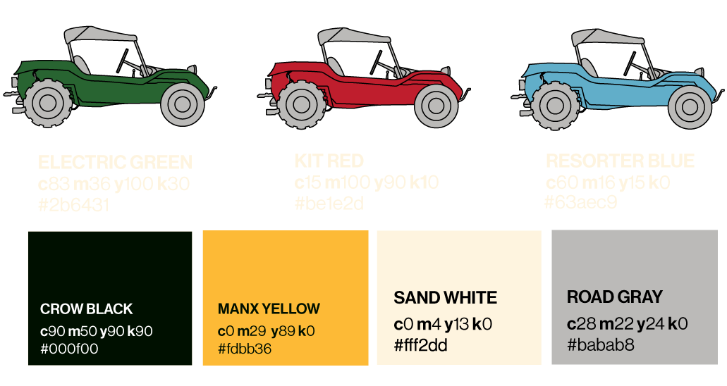
Color
Typography
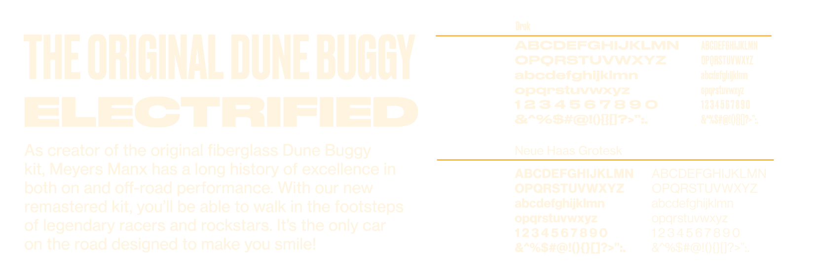
The company has used their original logo and typography system since day one, facing challenges as the company evolved into a world that combines digital, print, and spatial elements. Versatility became a priority in the evolution of their identity system.
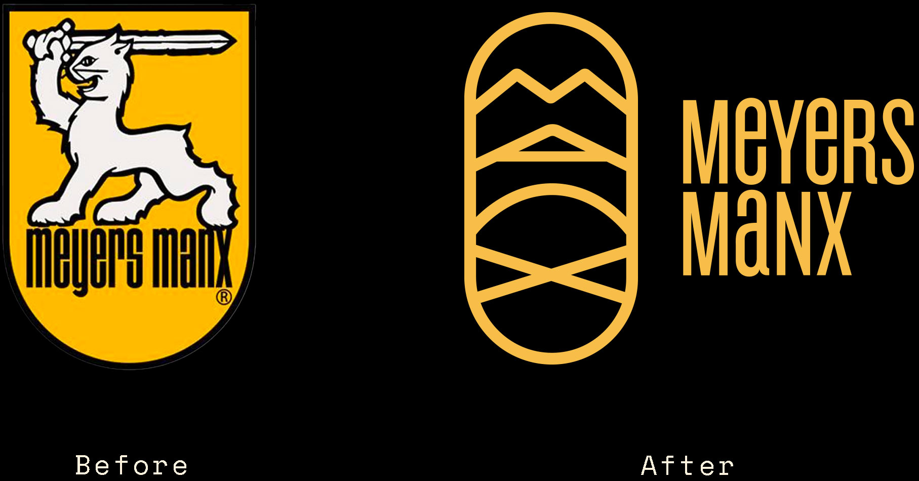
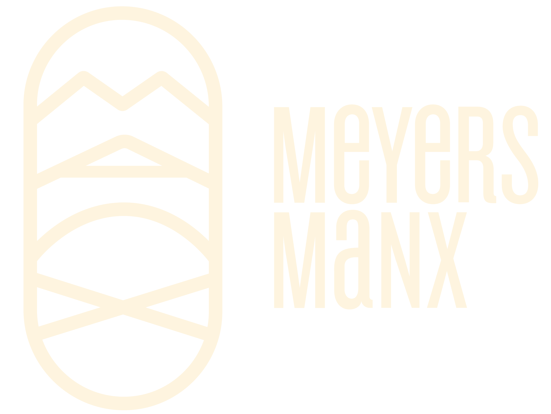
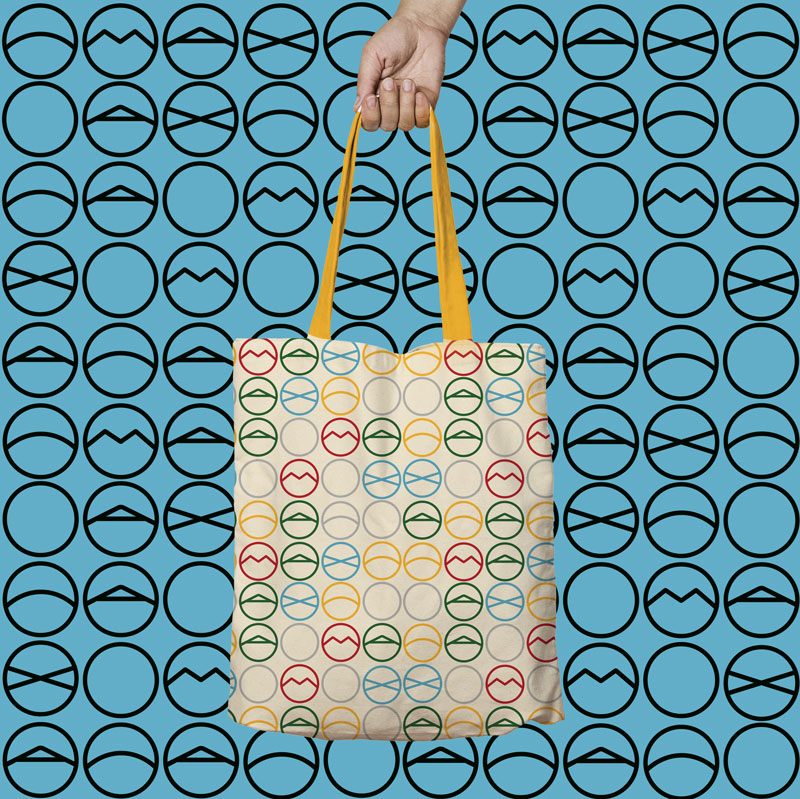
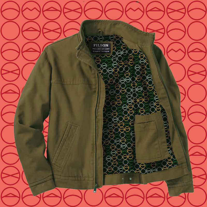
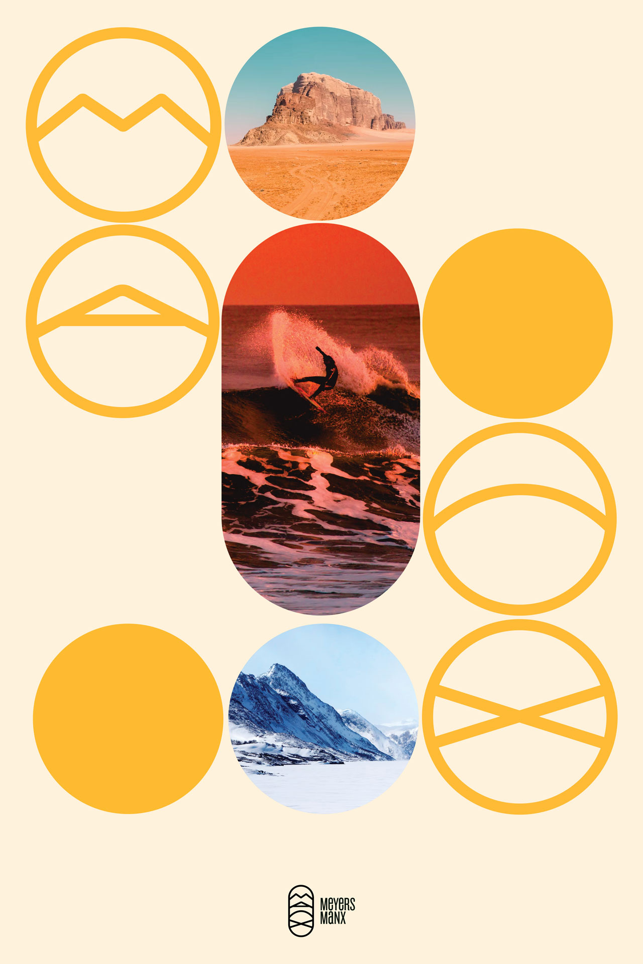
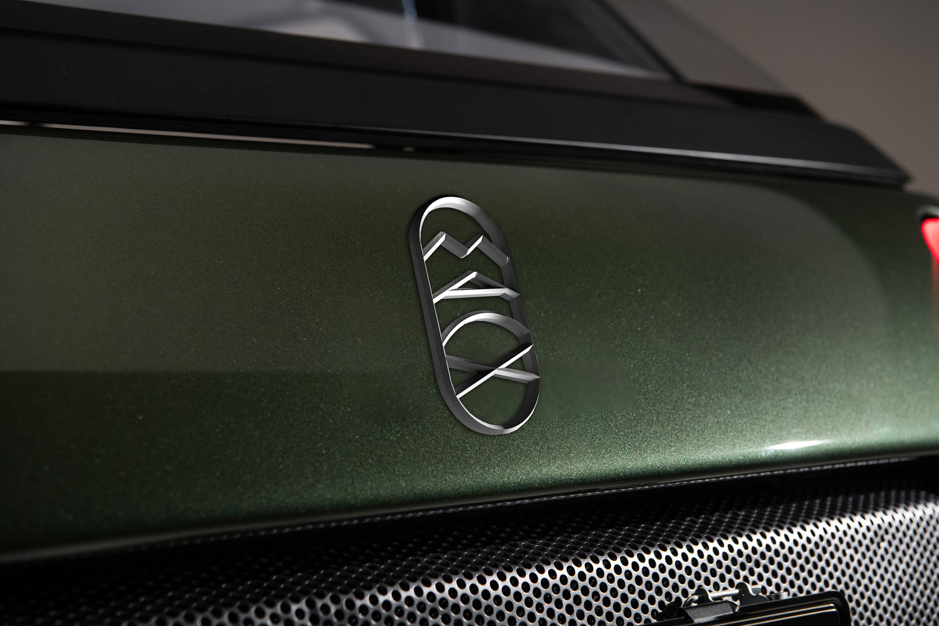
Inspired by mountains, roads, and beaches, the new emblem can take on many roles while remaining the central element. It can provide a space for photography, appear as typography, or set the stage for a variety of patterns that add color and movement to the brand.

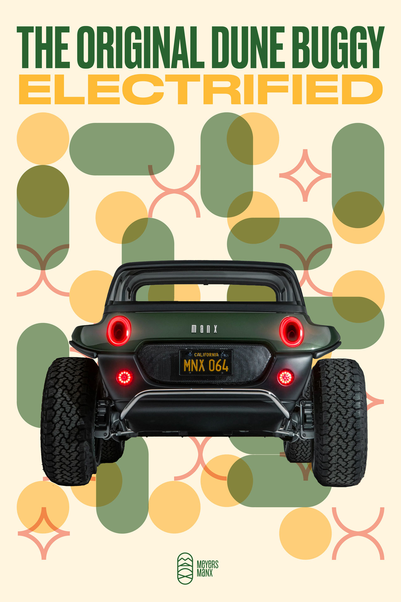

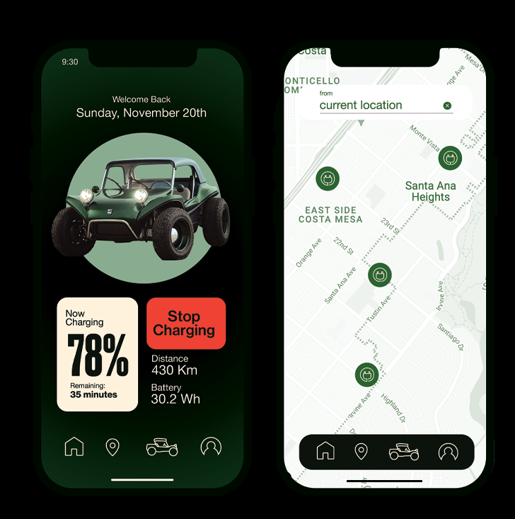
Specific deliverables had to be addressed for the release of the electric Manx 2.0. A companion mobile app can help users monitor the battery on the vehicle or find the nearest charging station in town, which become an opportunity to introduce the brand to other drivers.
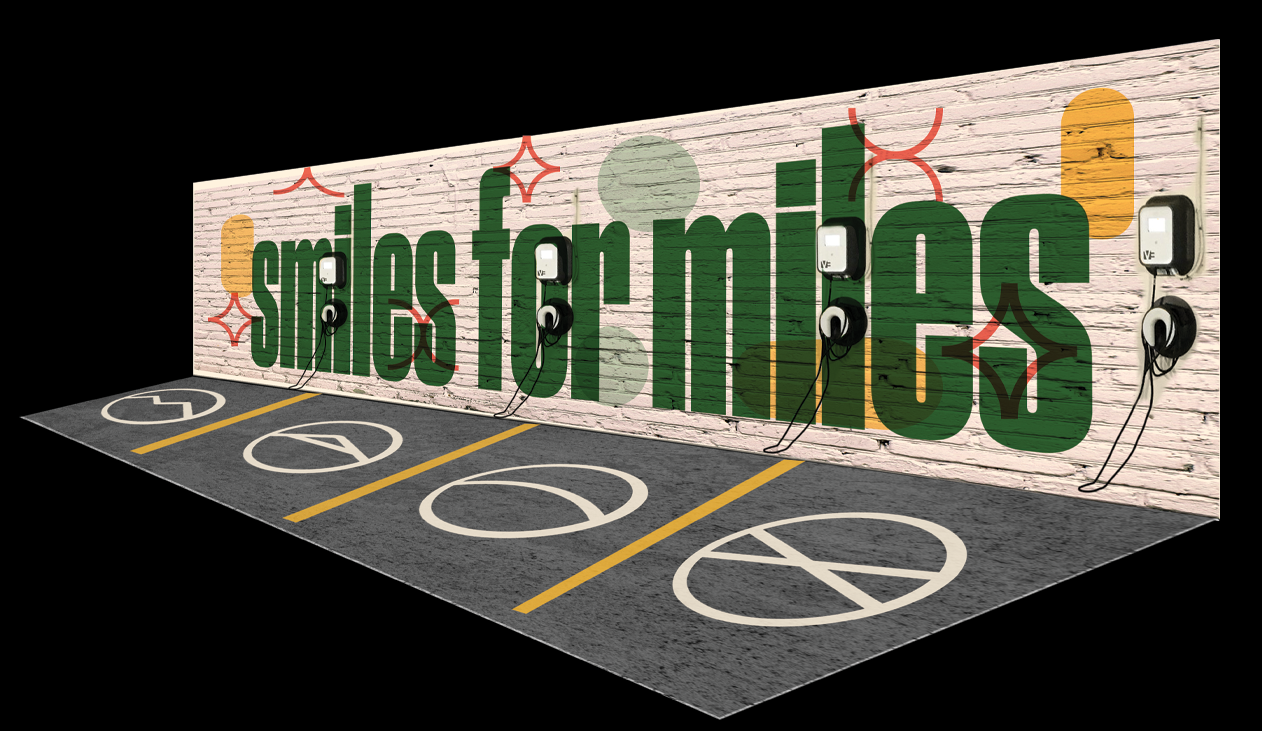
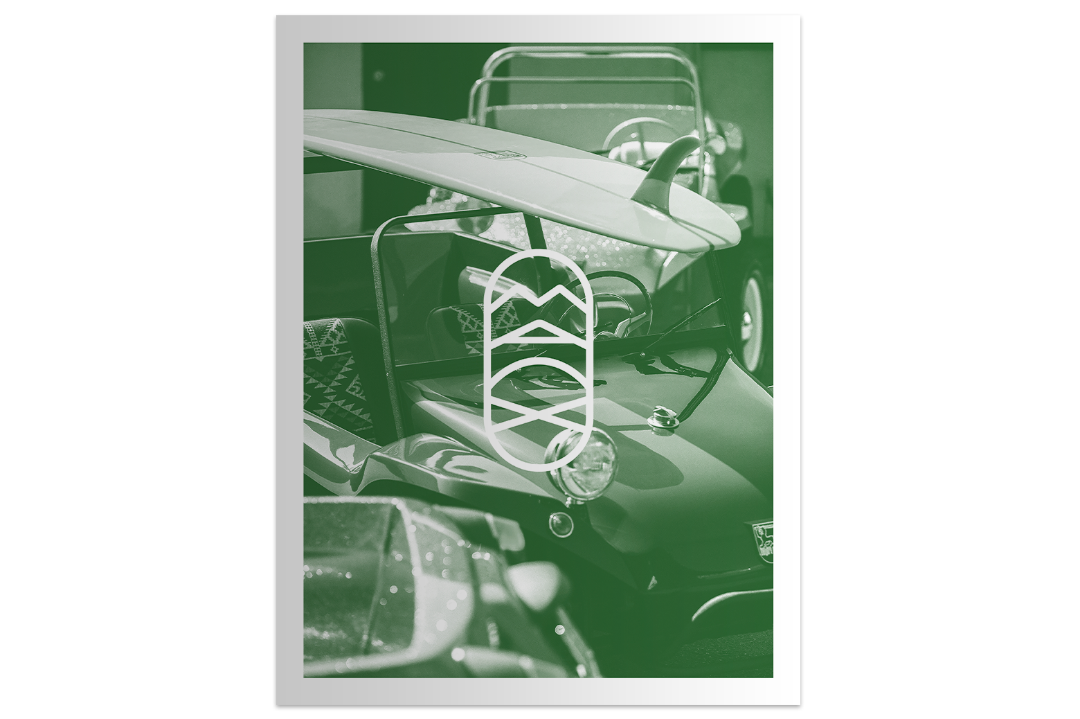
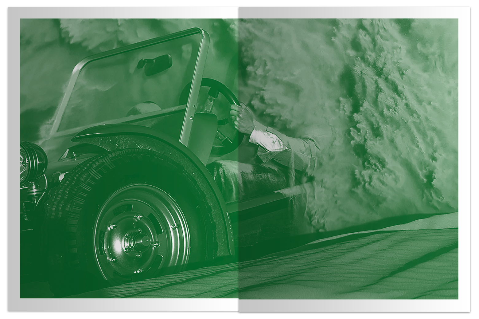
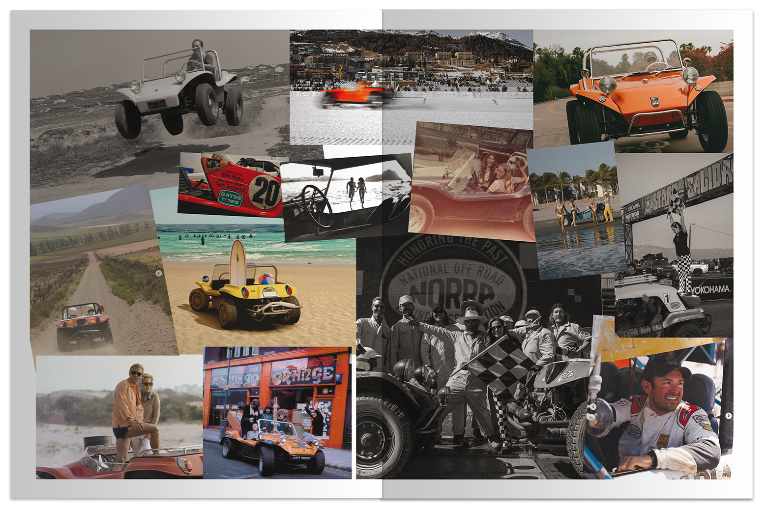
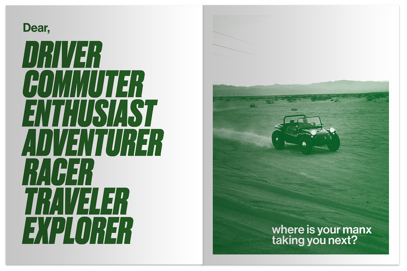
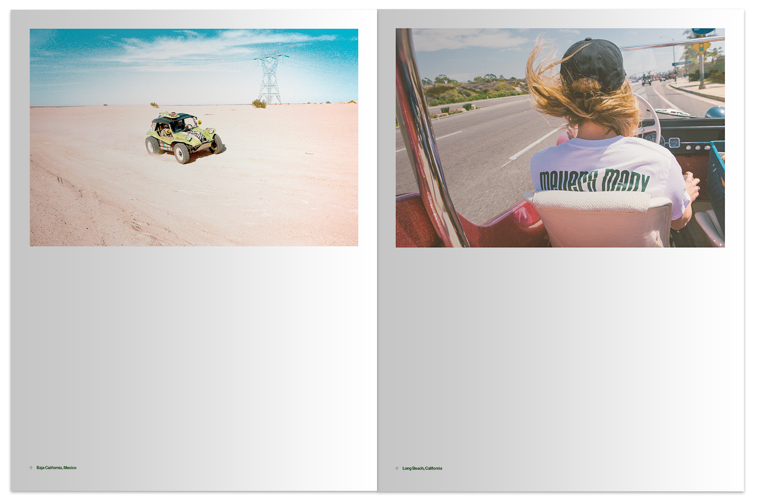
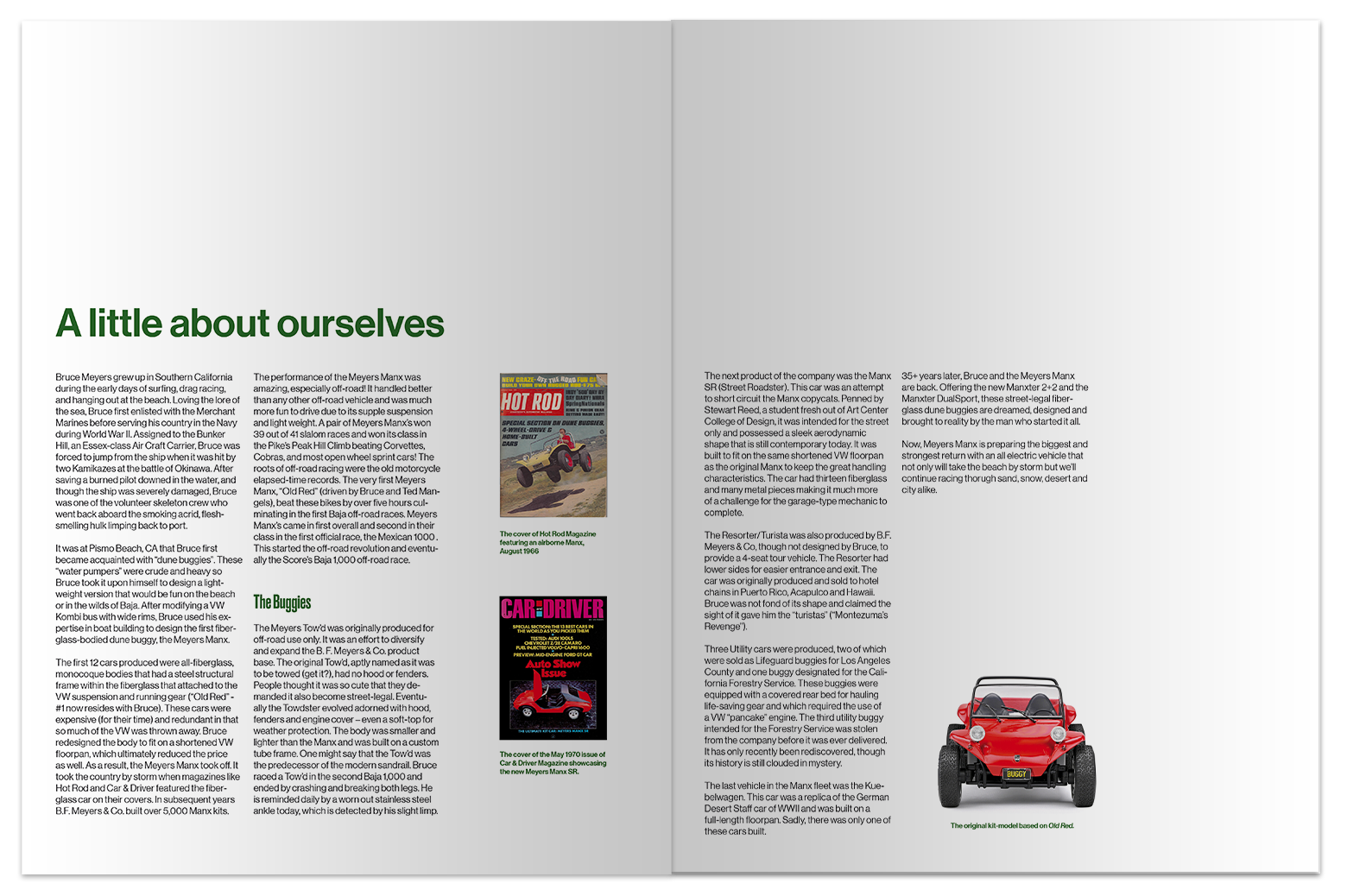
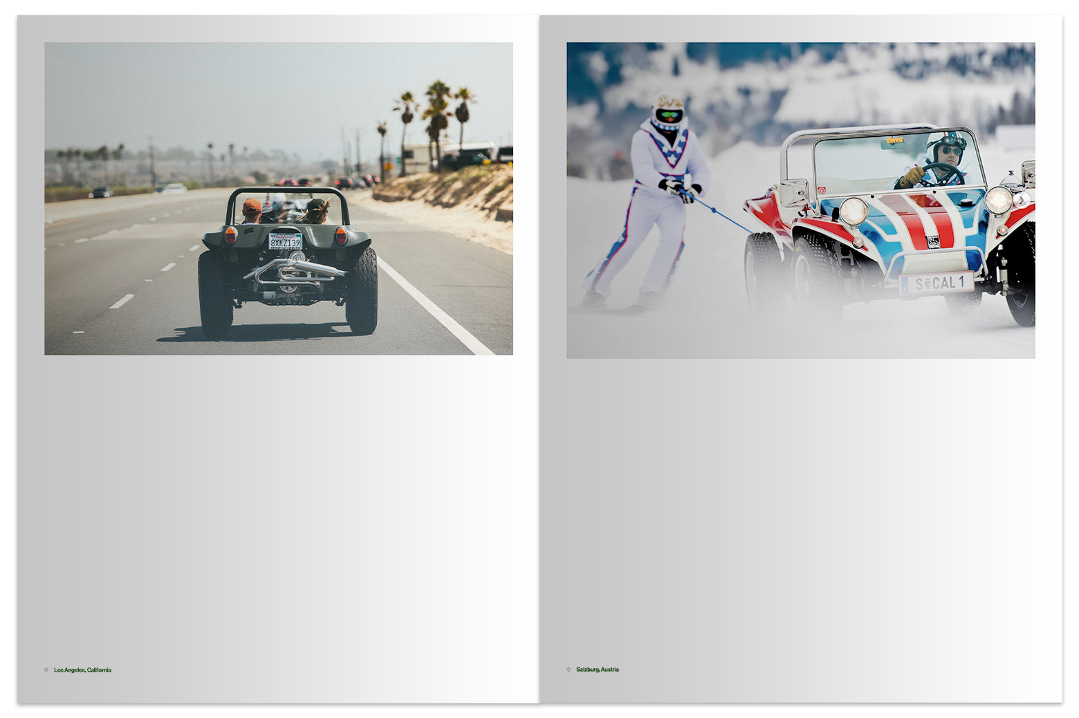
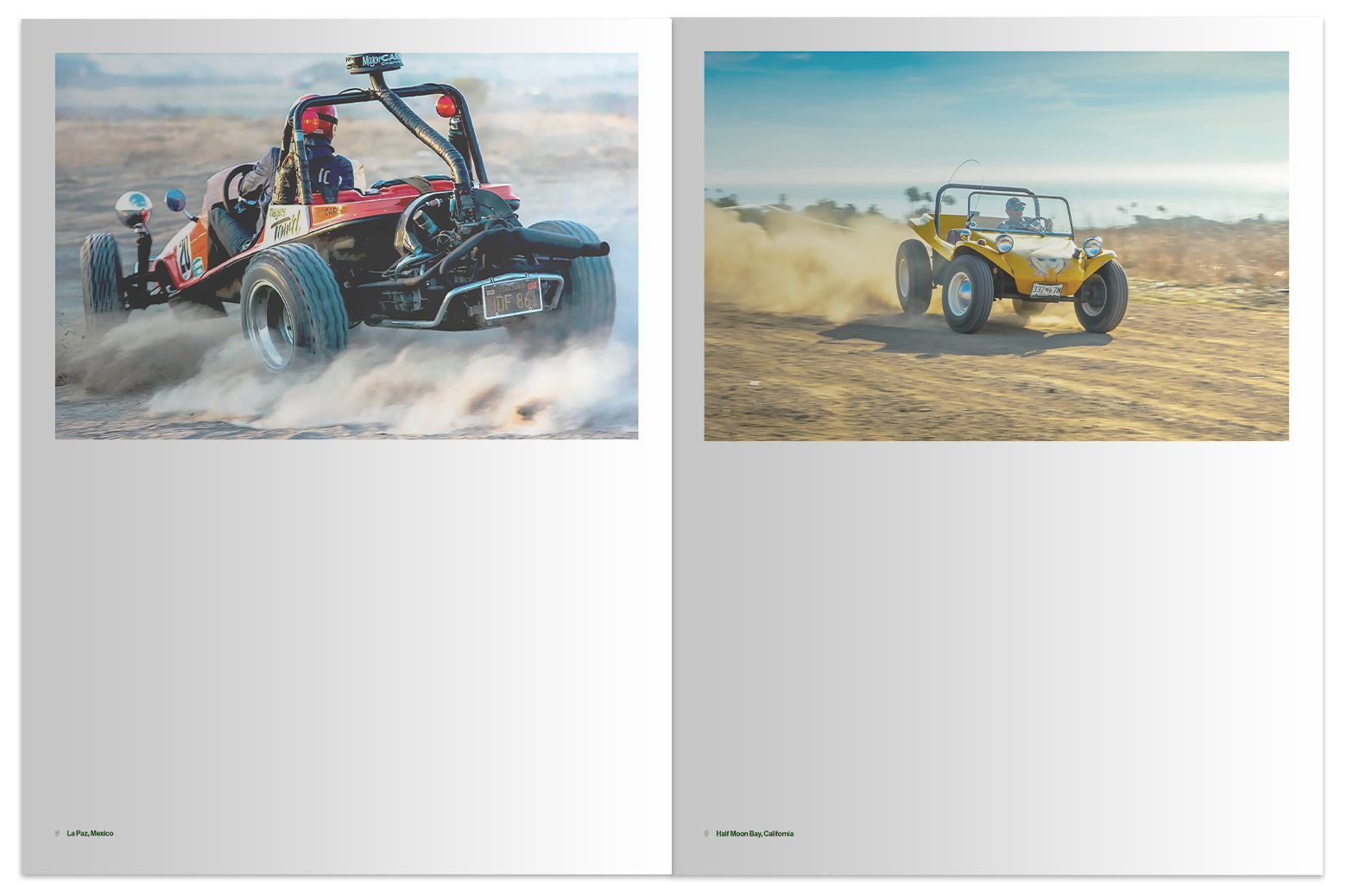
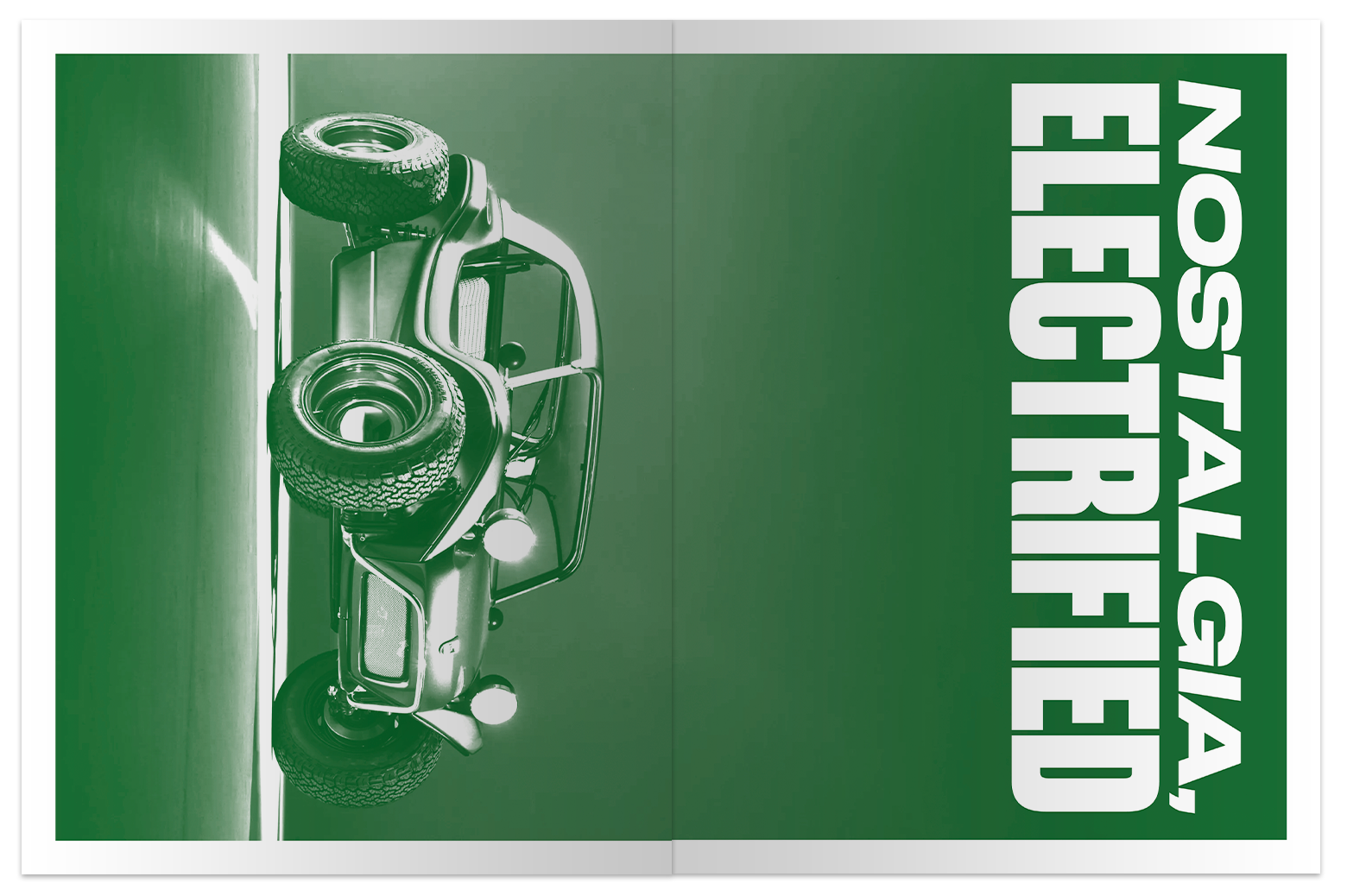
As investors of the new models await for their vehicles in production. A newspaper booklet was created to introduce them to the brand and help them envision their future adventures.
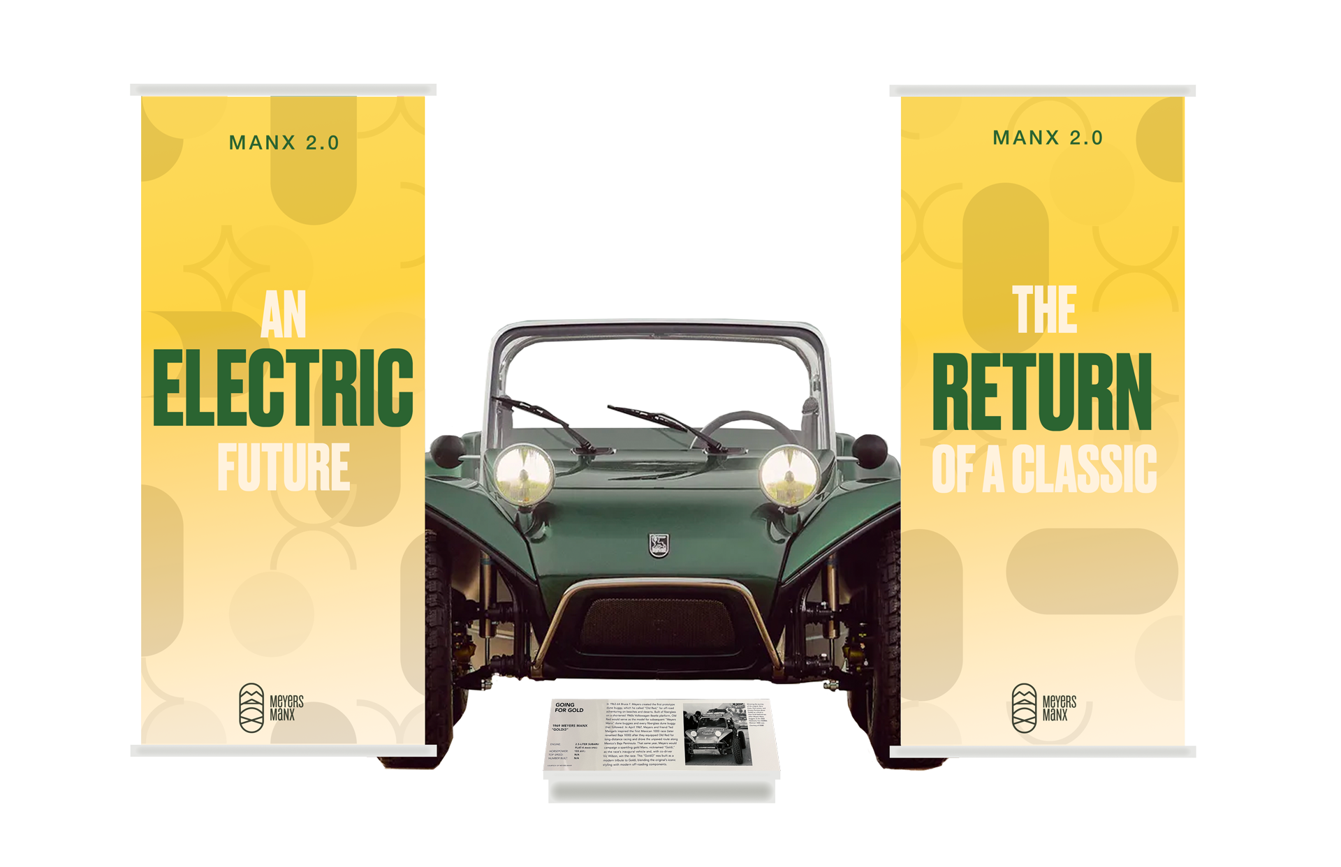
To celebrate the Manx 2.0's introduction to the Petersen Automotive Museum, banners celebrate the vehicle's legacy while looking forward to this new chapter.
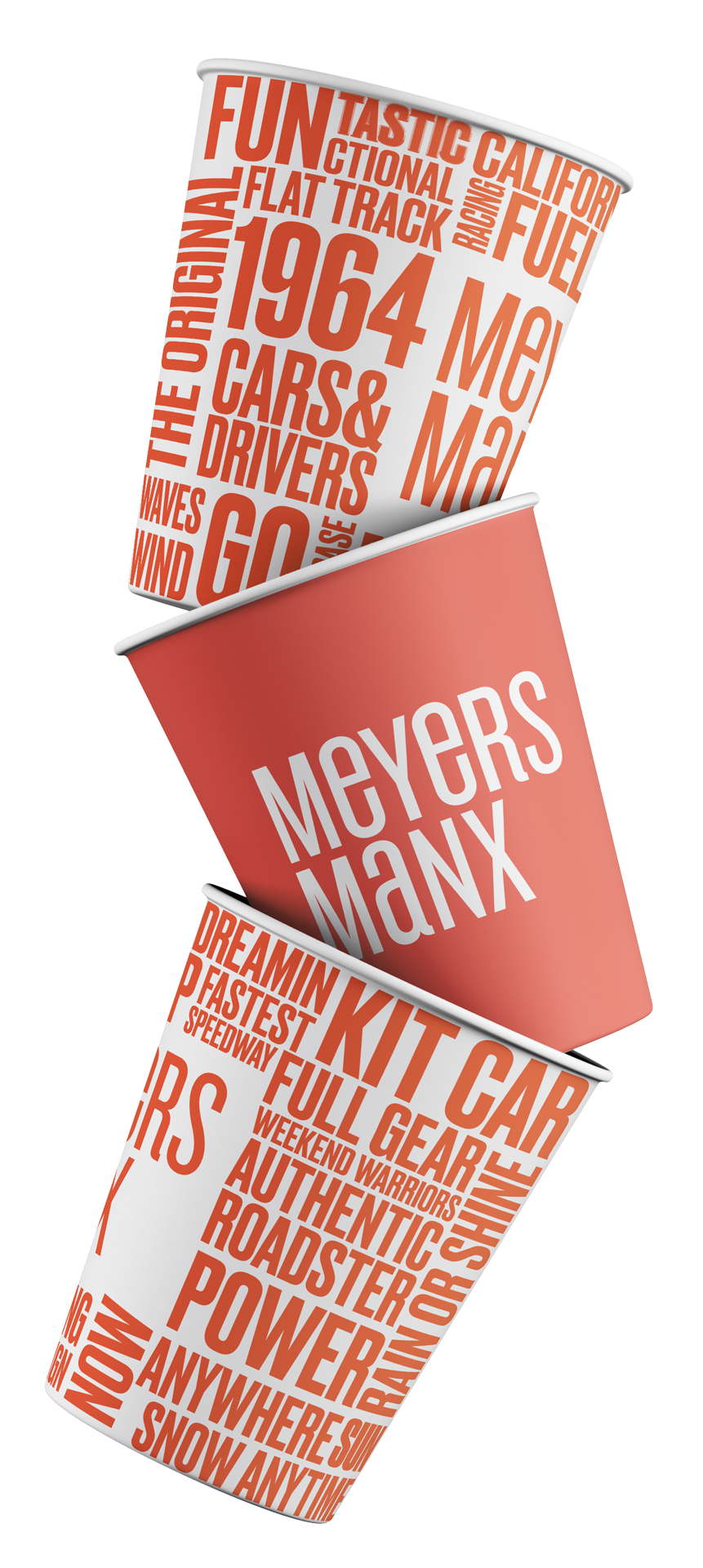
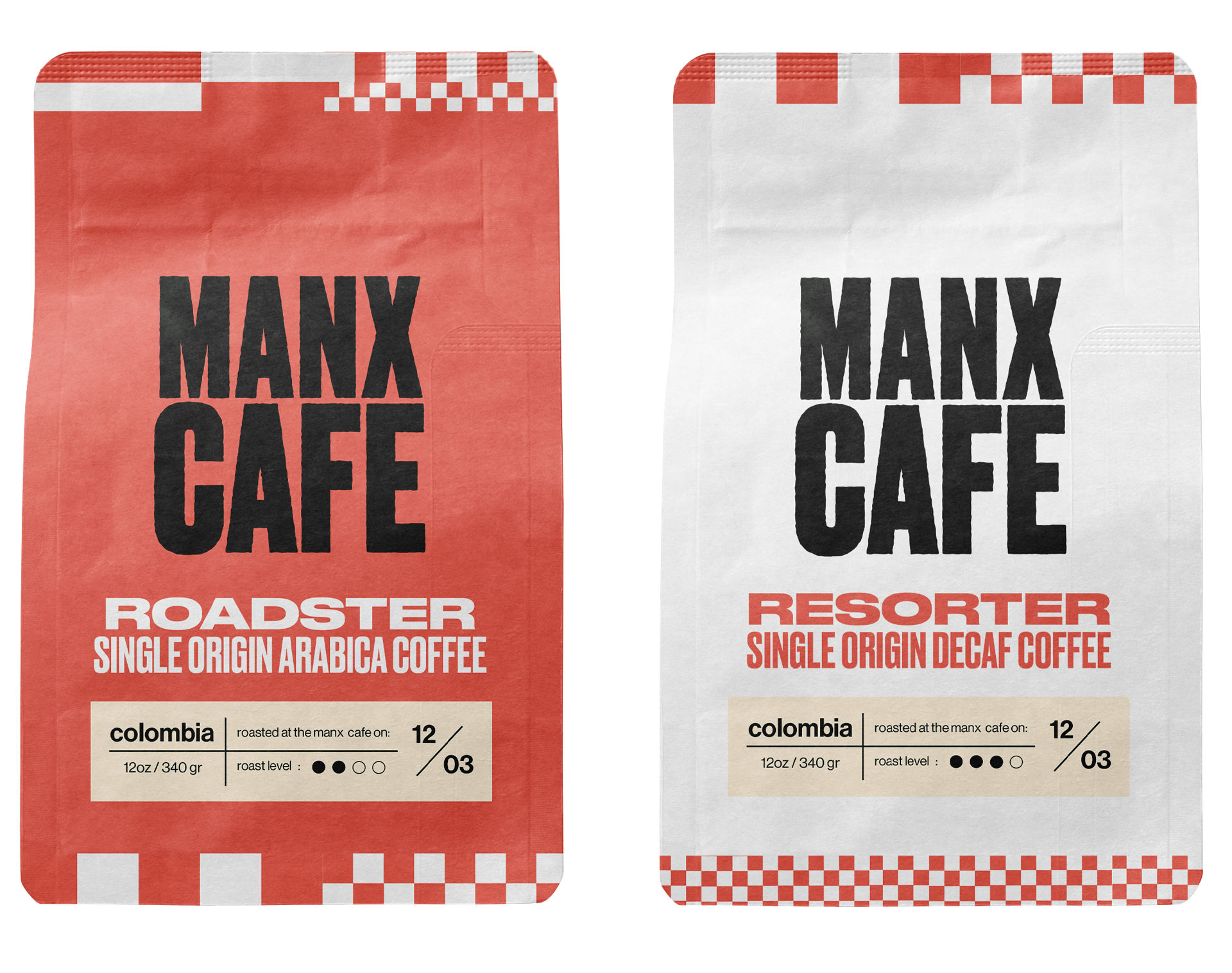
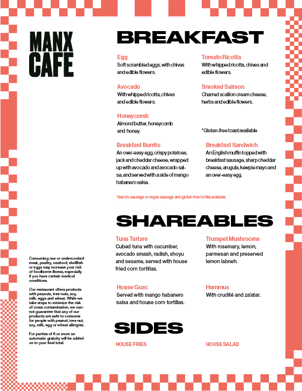
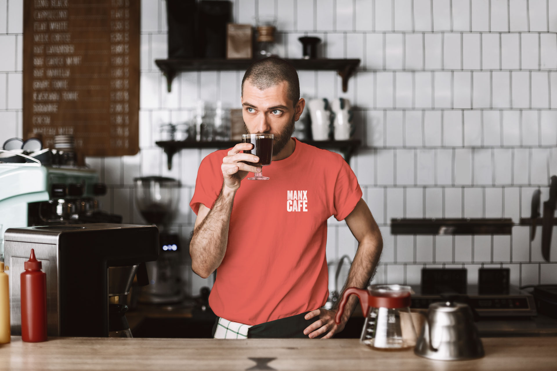
Meyers Manx is also the host of a cafe located in the Petersen Automotive Museum, the perfect opportunity to introduce the brand to car lovers. The cafe functions as an extension of the language set for the brand but provides a more literal approach to car culture so museum attendees can easily find themselves immersed in the brand.
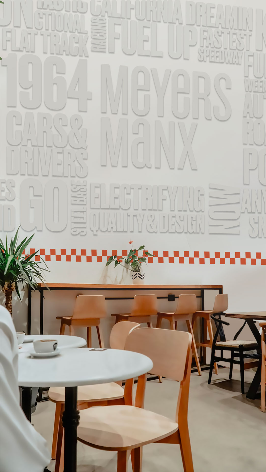
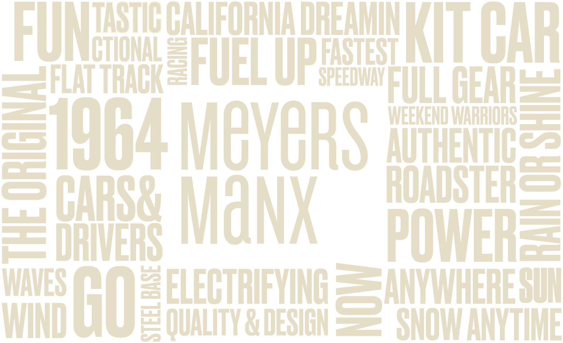
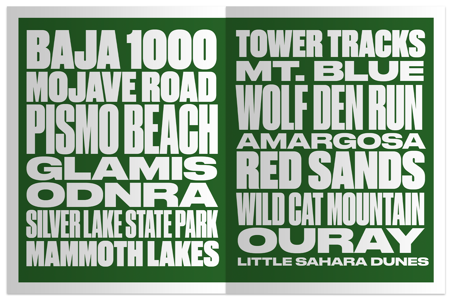
Keywords that fuel the Manx lifestyle become a wall installation that will resonate with museumgoers.
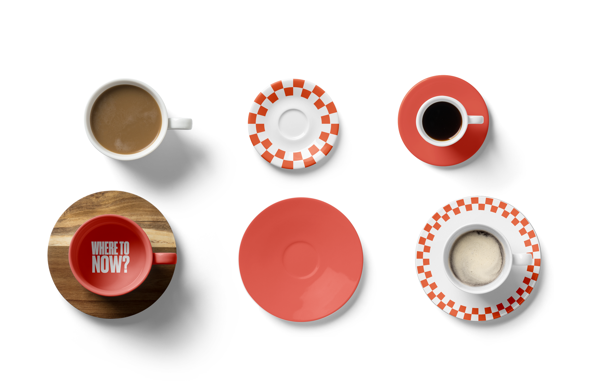
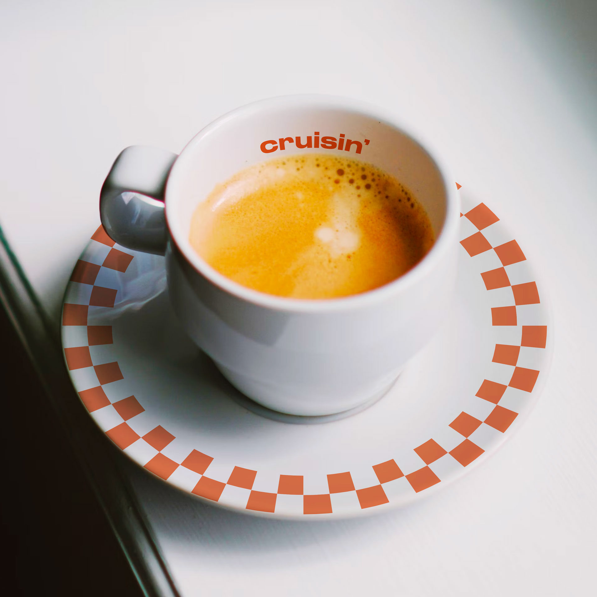
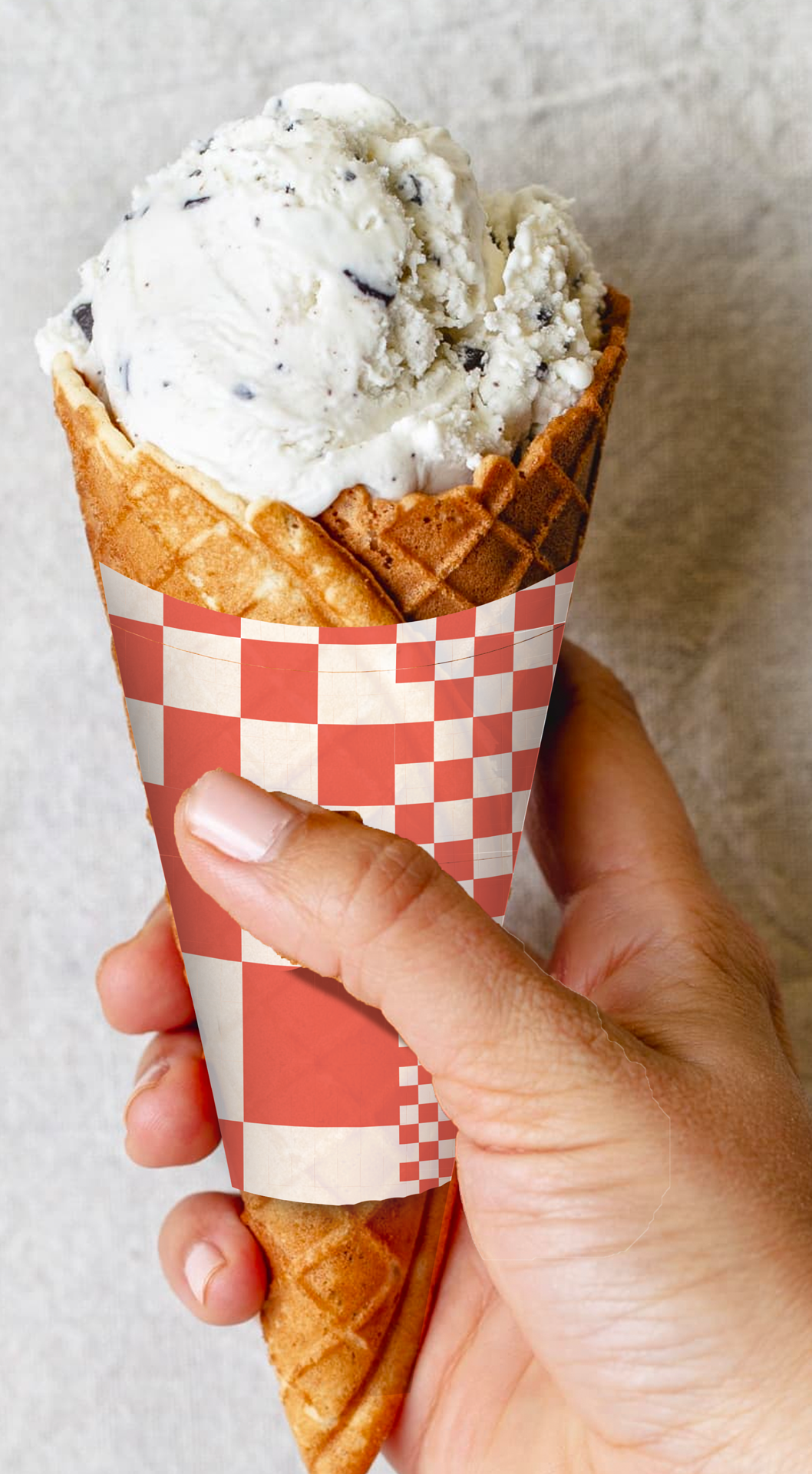
A new pattern was introduced to give the cafe a distinctive element to contrast the brand. A new approach to the traditional checkered flags in racing culture but updated for a new generation. The featured color red on the other hand, provides a blending element with the museum's architecture.
© Ana C Vazquez 2023
