Practice
Positioning
Packaging System
Font Design
Photography
Illustration
Annie's Homegrown
Annie's Homegrown is a popular organic and natural food company known for its wide range of macaroni and cheese products, snacks, and other organic food items. Founded in 1989, Annie's is committed to producing delicious and wholesome foods using high-quality, organic ingredients.
After auditing Annie’s entire line of products, we realized that the brand was in need of consistency in their packaging system while showcasing their joyful and energetic personality.
Brand At-A-Glance
Logo
Color
Typography
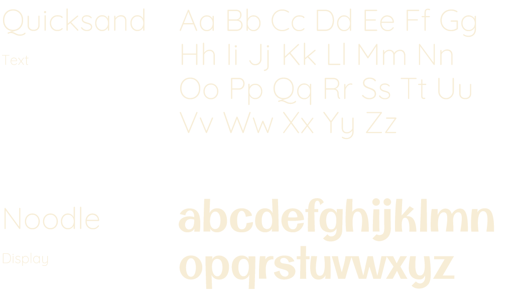
Illustration Style
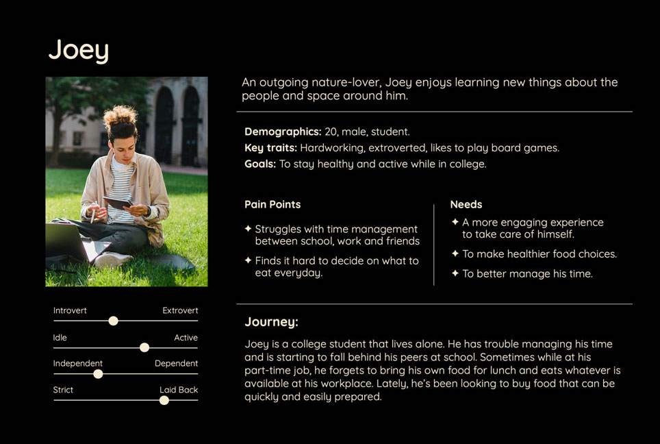
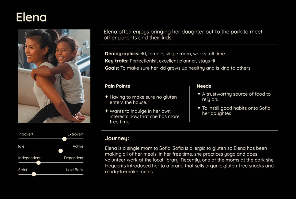
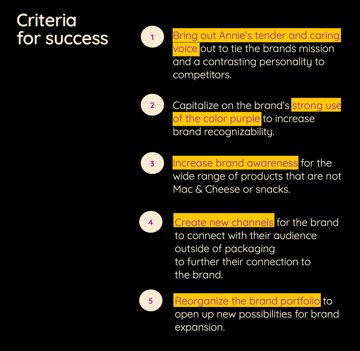
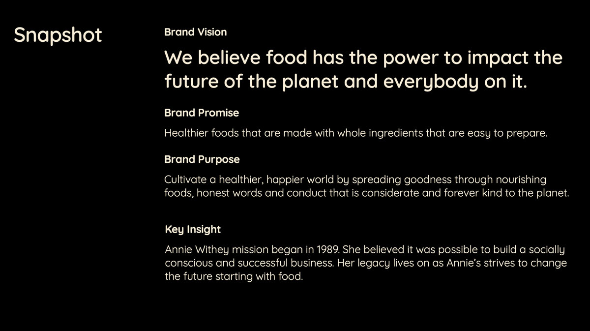
To guide the new concept we created two personas that reflected Annie’s target audience, determined a Criteria for Success list, and reworked a mission and vision statement for the brand.
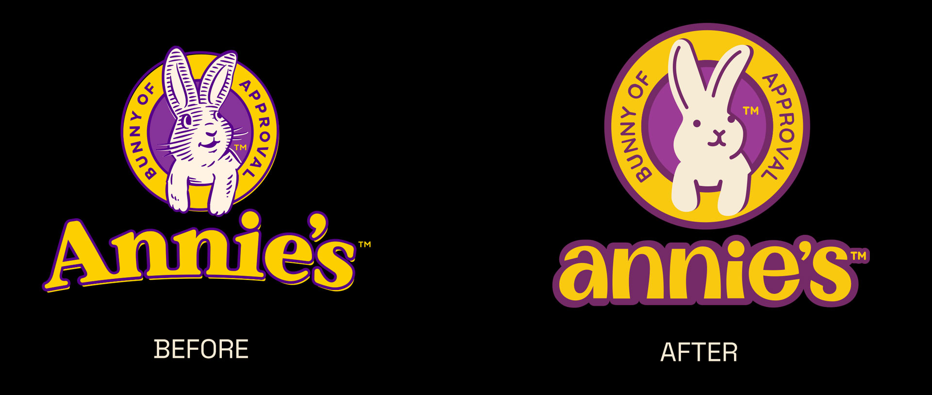
The new logo and wordmark are an evolution that targets versatility for digital and print environments. The wordmark was custom-drawn to better convey the lively energy of the brand.
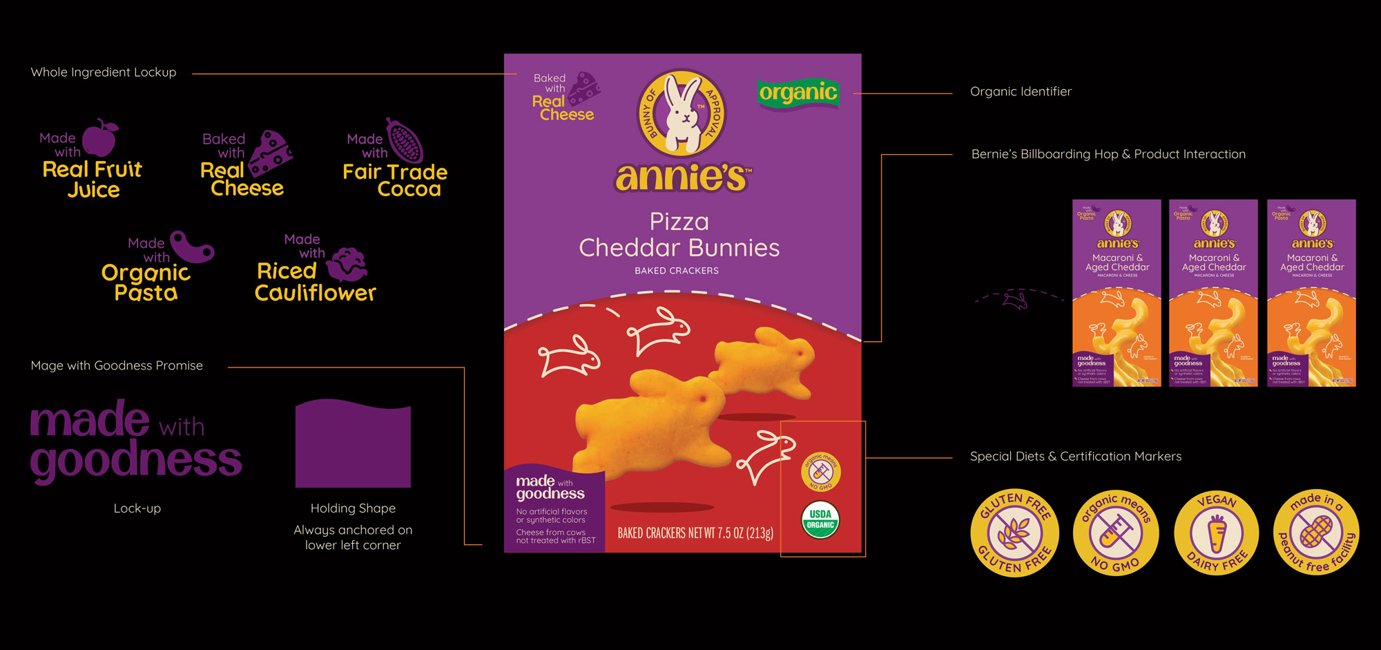
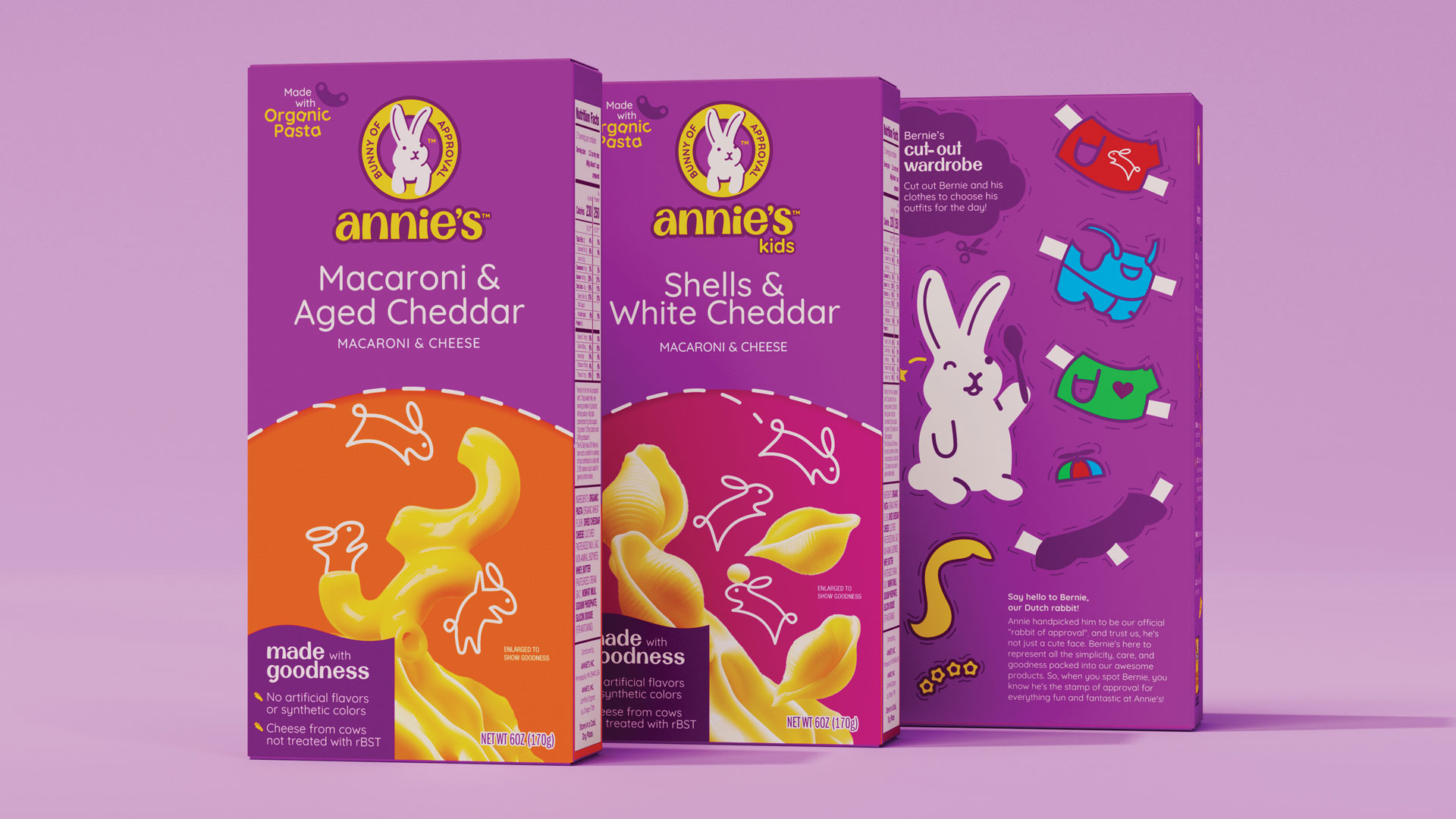
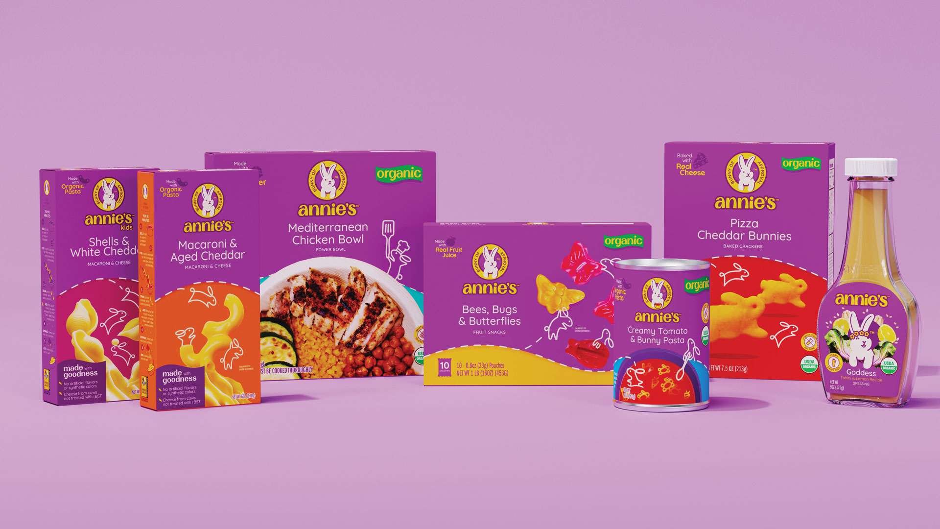
The new packaging system utilizes color, typography, and illustration to differentiate between products but looks to strengthen brand recognizability across a wide range of offerings.

To help shoppers with different dietary needs, the different call outs in the main display now have a system for their placing.
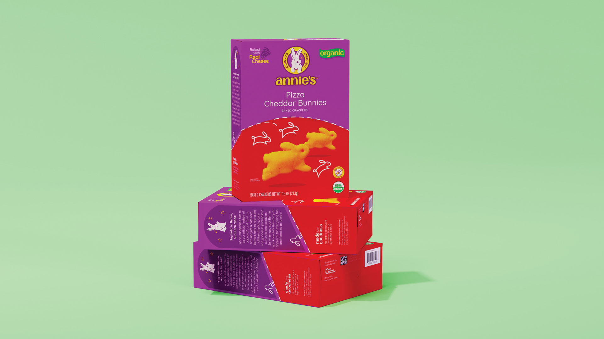
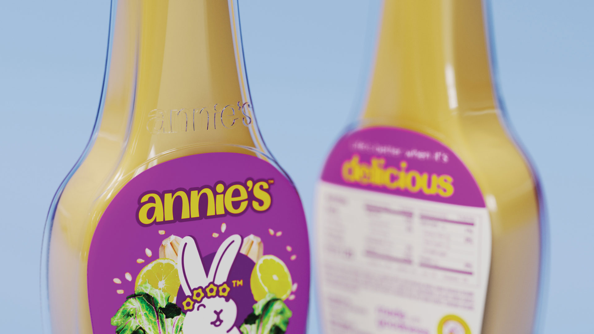
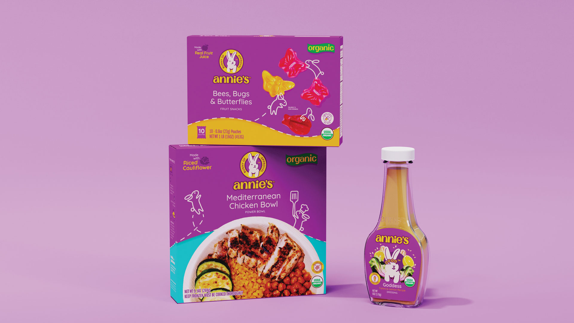
To tell a more relatable story, we shot stop-motion pieces that showcase the product from the shopper's point of view.
The new identity and packaging system looks to communicate Annie's caring nature by taking extra care of special diets, showcasing their wholesome ingredients and bring a little joy for everybunny.
This project was done in collaboration with Kerrie Chu.
© Ana C Vazquez 2023
